Now YOU feel Daddy's scratchy face!


Pat the Bunny by Dorothy Kunhardt

It took my baby a while to warm up to this book. Perhaps the quiet, pastel-hued art just didn't grab her. Also, touch-and-feel didn't really interest her until about 7 months. (She liked other touch-and-feel books before this one.)

The first spread she wanted to play with was "Now YOU play peek-a-boo with Paul." She would grab the little turquoise cloth flap and peek at Paul. So, it was a lift-the-flap experience first. (She liked lift-the-flap before touch-and-feel.)

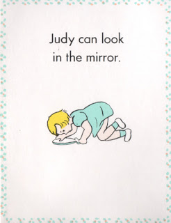
Then she liked flipping through "Judy's book." Another lift-the-flap experience.

Daddy's scratchy face was the first texture she would touch. Then, later, it became her favorite page (indicated by her smiling, laughing, and/or looking up at me when we would turn to it). It's funny, because she likes to play with her own dad's "scratchy face." In fact, my husband has a little goatee just for her. Is it possible that she was making the connection to her real-life experience? I really think so!

Here is a picture of her touching her uncle's scratchy beard, making the same scrunchy-face smile she makes when we turn to the page in Pat the Bunny.


Anyway, I like to think she makes the connection!

Eliza also likes the mirror spread. She will peek in it and make eye contact with me through the mirror (and smile!). I must say, though -- the art on the mirror spread is one of the lamest pieces of children's book art I have ever seen. Come on, Dorothy! Who looks at a hand-held mirror like that? Did Judy fall over?


Eliza also likes to stick her index finger through "Mummy's ring." It is so cute to see her work her tiny finger through that hole. Takes some dexterity, I think!

Anyway, the funniest thing about our experience with this book is that Eliza refused to "pat the bunny" for the longest time. She would interact with every other page (she would even touch the flowers, which are meant to be sniffed-- lost on her)... but the bunny was always ignored. If I tried to put her hand on the bunny, she would yank her hand out of mine very quickly.

Finally, just a few days ago (right around 9 months), her little hand ventured to touch the bunny fur. It was the very last feature she found. Oh, the irony.

The amazing thing to me is that they still bind this book with a plastic comb binding. My daughter considers this one the touch-and-feel features, as she will frequently touch that part of the book (in fact, she touched that part of the bunny spread before the bunny). My daughter also likes to chew on this book more than any other, and she has managed to get bits of paper off the spine. So, we don't let her play with this book unsupervised.

Anyway, I recommend this book as a "stage two" infant/toddler book, after your child has learned to enjoy flaps and textures in other books.

Things You Might Not Have Known About Goodnight Moon


Goodnight Moon by Margaret Wise Brown, illustrated by Clement Hurd

I have read this book at least once per night since Eliza was three months old. And I have not gotten sick of it-- that is the magic of Goodnight Moon for you!

During my four-month study, I have managed to notice a few things about this dear old classic. Here is my current list:
  • You can hunt for the mouse in every scene.
  • The moon rises higher each time it’s in the window.
  • A copy of Goodnight Moon is on the nightstand, all green though.
  • A copy of Runaway Bunny (by the same author and illustrator) is on the bookshelf, also all green.
  • The socks on the rack disappear when we say goodnight to the mittens on the rack. This was surely to avoid the oddness of looking at socks *and* mittens while bidding goodnight only to the mittens. (The socks get their turn with the clocks.)
  • The red balloon is sometimes visible in the corner of the room, sometimes not. I imagine it floating around the room, phantom-like.
  • The teats appear to have been edited out of the cow jumping over the moon—they seem to be painted over, sometimes not so well. Since I work in publishing, I imagine some executive-level person being uncomfortable with the teats, and the art having to be corrected. Who knows!
  • The cow jumping over the moon appears in the Three Little Bears painting, too.
Now if I put on my "children's book editor" hat, I can tell you a few other things I notice... If you can bear with me...
  • The word "goodnight" actually does not (yet) exist as one word in English. It is two words according to Websters (and therefore to the proofreaders of the world). You would think the sheer force of Goodnight Moon would have forced Websters to concede. But alas. (There are lots of similar situations, where common usage has married two words and Websters insists that the union is not legal. Rain forest and shoe box are examples. Or, sometimes Websters allows two words that are commonly married to be joined with a hyphen, kind of like a domestic partnership. "Good-bye" is in this camp. Issues like these force copy editors and proofreaders to wear down a lot of pencils.)
  • There is no punctuation in Goodnight Moon. No periods to end sentences. Nothing. I suppose a copy editor could look the other way because it's poetry.
And about the art. . .
  • You know how there is a limited palette of colors? Goodnight Moon was published so long ago (1947), it was before our normal four-color printing process came along. So, each of those colors was its own color plate. It looks to me like they had a red plate, a blue plate, a yellow plate, and a black plate. I bet the green was made by printing the yellow on top of the blue. So, imagine the page being composed of several layers of tracing paper, one layer for each color. Everything that was red on the page would have been rendered by the artist in black on the "red layer." Then the red printing plate would have been made out of that layer. So, you would have only seen the scene in color once it was printed... Not an easy way to illustrate a book! (Now, fyi, Goodnight Moon is printed on a normal four-color press. It's much more expensive to print it the old way now.)
  • A longtime veteran in the children's book world, Christopher Franceschelli (who founded Handprint Books), told me that the reason the book has alternating color spreads and black-and-white spreads is because that was a common money-saving technique back when GM was published. So, instead of printing the whole book in color, they printed only half of it in color. Impressive how they made it seem completely intentional (as if it was done for visual variety and pacing), alternating between quiet vignettes and full-room scenes!
Eliza is calling me now... Better go! Goodbye for now! (Or Good-bye!)

Another Side of Richard Scarry


I am a Bunny
by Ole Risom, Illustrated by Richard Scarry

If you are most familiar with Richard Scarry's art from "Busy, Busy Town" and his various books about "things that go," this book will show you a whole other side of his talent. It has lush, painterly nature scenes in which a little bunny, Nicholas, plays with butterflies, watches birds and frogs, and takes in the changes of the seasons.

The trim of the book (tall vertical) gives each scene an a sort of grand theatrical quality. You know how opera scenery can be so big and grand that the actors look small? These tall nature scenes with a little bunny in them have a similar grandeur to them. And yet they are still so sweet. The bunny's expressions and poses are adorably childlike. Here is my favorite:


(I am no butterfly expert, but it seems that he has taken care to depict real butterflies. Same appears to be true of the birds on other pages.)

My baby seems to study the scenes; since Nicholas wears the same bright outfit in almost every scene, I think she is noticing him. Once she develops language it will be fun ask her, "Where's Nicholas?"

The text is very simple-- nothing special, but very easy and sweet to read to a baby. Just one simple sentence per spread. It is really a perfect introduction to the seasons. I can't recommend it enough! (And I thank the colleague who recommended it to me!)